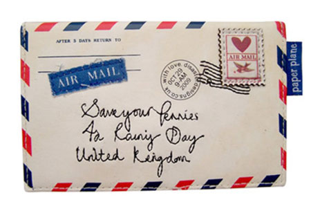
When it comes to direct mail marketing, looks are (almost) everything
Published October 11, 2013 at 2:03 pm

Throughout our lives, many of us have heard the expression “don’t judge a book by its cover,” and while this sentiment certainly applies in a number of different scenarios, I think most of us would agree that when something is visually appealing, it’s apt to pique our interest. This is particularly important for brands to keep in mind when coming up with direct mail marketing ideas.
“In a world where everything is going digital, there’s now something very special about receiving mail in the post,” states Creative Bloq in a recent article featuring 15 creative envelope ideas. “And, being the first thing you see, the envelope design is just as important as its contents.”
So, what’s the best way to ensure that your envelope makes a good enough first impression on its recipients for them to rip it open and see what’s inside? Consider the following best practices:
Be provocative – Write teaser copy that generates interest and leaves people feeling like they just have to know more. Great strategies include posing a question and indicating that the contents contain something of value to your audience.
Play around with different shapes and sizes – Who says an envelope has to be rectangular? Norwegian graphic designer Miriam Sørli Onarheim had the right idea with this unique design, which is sure to stand out.
Use your space wisely – Remember that you don’t have to limit your copy and design to the front of the envelope. Since you have all that “real estate” to work with, think about creative ways to take advantage of it.


comment closed