NFL changes it’s Super Bowl logo
Published June 13, 2014 at 10:13 am

When it comes to logos, changing the appearance of a brand’s iconic mark must be handled carefully. We recently talked about how a great logo is essential for branding success, noting that Google recently made a very slight alteration to its logo that most people would not even notice.
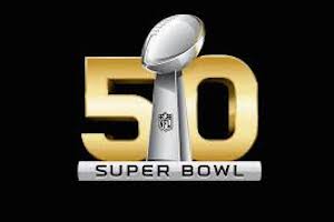
A more obvious change has come to the logo for the 50th Super Bowl, Bloomberg Businessweek reported. The NFL logo for the Super Bowl has long contained Roman numerals to convey the year of the event. However 2016 will be different.
Why the change?
The NFL felt that the “L” made the logo look unbalanced, so they elected not to use it to denote the number “50.” Instead, the new logo will feature an Arabic 50. Although this isn’t the first time the NFL has used Arabic numbers, they have not done so since 1971.
Aesthetics play a major role in how a logo is perceived, so it makes sense that the NFL might want to consider changing a logo that did not look quite right. On the other hand, changes to logos that have been working for a long time have met with poor reception.
For example, when the Olive Garden updated its logo as part of a rebranding effort, the change was perceived so poorly that the company’s stocks fell. The departure from their classic logo did not sit will with some consumers.
According to Today.com, the response on Twitter has been mixed, with some Tweeting their support for the NFL’s change, and other’s wondering why it was necessary.
Despite what people may be saying today, the ultimate effect of the new logo for Super Bowl 50 remains to be seen. Changing a logo is something that requires a great deal of consideration and planning, something every brand should consider.


comment closed