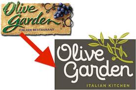
Olive Garden debuts new logo, stocks fall
Published March 17, 2014 at 9:59 am

Major changes to a brand need to be monitored so that companies can know for sure whether or not they are effective, because sometimes they can have a direct effect on the company’s financial standing.
TIME magazine recently made an interesting observation along these lines: not only has Olive Garden recently changed its logo, but its stock dropped by 5 percent on the same day. Correlation may not be causation, but the attempt at rebranding the Italian-themed restaurant doesn’t seem to have landed well with customers or the media.
For years, the company has advertised itself using cursive green lettering against a background that suggested the walls of a plaster Italian house and a grape cluster to conjure up the feel of the restaurant.
The new logo still features a branch, but it no longer bears grapes and instead is rendered in a a smooth, pastel green color. The name of the restaurant is white and in a smoother, loopier style that links it to fonts like Helvetica.
On Twitter, commenters seemed mostly put off by this redesign. Business Insider collected some of the more notable tweets (including some with explicit language) and features a whole range of putdowns aimed at these changes. One Twitter user even said that this logo looks “like it was drawn with a breadstick.”
It appears that the company that owns Olive Garden, Darden Restaurants, has a lot to lose should their venture fail. As Bloomberg notes, it comes in combination with a series of new menu options. Handling these changes delicately is important for any business, as even the smallest changes might be noticed and seized upon.


comment closed